Showing posts with label Unity Stamp Company. Show all posts

Sunday, April 4, 2021

613 Avenue Create - April 2021- Challenge #4 - Anything Goes w/Optional Twist: In The Garden (Create A Card for Spring)

 Hello, Crafty Makers!

613 Avenue Create's April challenge is a chance to shake off the "Winter Woes" and to "Revel in the Magic of Spring.  Anything you might find "In The Garden" can be used as the theme of your project!

BLOOM
Where You Are!
This project was inspired by a Jo Rice Tutorial. 
Lately,  I find myself having the most fun in my attempts to recreate trendy projects using the stamps I have on hand. I must admit that the projects involve quite a bit of, "Oh, wait, I know I have a flower that looks almost just like that," followed by forty-five minutes to an hour looking for "that" flower stamp.😀 The redemption comes from the joy of finding "that" stamp and few others too.

Owning all of the AALL & Create Stamps is not in my crafting budget.  I have purchased a few (Thanks, Uncle Sam,) and I have set a goal of purchasing bundles when offered at Hochanda and Craftstash.  Interestingly,  I have discovered many stamps in my stash that make great substitutes.  In November of 2020, I used my birthday money to order a bunch of border stamps from AliExpress. They were cheap, and the store owner showed pictures of how these stamps could be cut apart and used individually! I use them all the time as a substitute when following a tutorial by Tracy or Jo.

This Unity Stamp has been stash since 2012.  I used to get the monthly kits, most of which went unopened. 
I planned to use this stamp with the script but it did not work. I opted instead for fussy cutting the petals and stacking them on the card. I stamped the image three times,  removed the leaves from all but one, and added them to the bottom of the floral spray.  I left them uncolored to continue the scheme of black and white spotlighting in the project.

This project attracted my attention for two reasons, the diagonal stenciling on the two layers, and the black and white spotlighting.  In the tutorial, Jo did not use Bundled Sage.  I just love Bundled Sage and Wilted Violet together. I used my  Crackle Stencil to add Sage highlights.
This beautiful butterfly is a Martha Stewart Stamp Set. I purchased this on December 14, 2011.  I used it for the first time two weeks ago.  It now resides in my "special" stamps container.  I don't want to lose it again.
One of the fun techniques I have learned in my recent classes is "partial stamping."   This image is the barrel of a fountain pen.  I only wanted the word "imagine."  I think partial stamping takes the project to the next level.  Now I look at my stamps through a new and exciting lens.
Another technique I am using more these days is stamping words from different sets and using them on my projects.  I am also doing more splattering.  I used Wilted Violet and Fossilized Amber to create the confetti splatter on this card.  
My blooms were "faux" watercolored with distress ink and pastel chalk pencils. I also used oil pencils to darken the center of the blooms. The spot color on the butterfly is Liquid Pearls.

I know this was a bit of a picture bomb.  Thanks for looking!
Hugz,
Chana Malkah

Stuff I Used:
Flowers: Unity Stamp Company- "everyday fairytale" (December 2012 Kit of the Month)
Stencils: Andy Skinner - "Bubbles" (Discontinued) 

Thursday, April 1, 2021

2021 STASH BASH #9 - HINDSIGHT (ALMOST BOKEH)

HELLO, CRAFTY PEEPS!
Last night, while sitting through a particularly boring Zoom meeting, I thought I would work on my Bokeh skills. 
 The term comes from the Japanese word boke, which means "blur" or "haze."
Unfortunately, the white ink I used to create my Bokeh circles faded more than expected.  By the time the stamping was completed, my circles were almost invisible.  I still like the final project, but the Bokeh effect would have made it an even better project!

My latest obsession is Lavinia Stamps.  Silhouette stamping is just so cool. I love creating these ethereal scenes. This card measures 7.25" x 5.50." I rarely create large cards, but I felt that this scene would look "cramped" if placed on a smaller-sized card base.

I wish the glitter had photographed because it adds so much drama to the scene.  Here,  it looks like snow!  My initial idea was to use Panpastels to color the background but the Distress Oxide Inks worked well and my makeup sponges made blending a breeze.  I was unsure if the Bokeh technique would work on top of the Panpastels™.  I probably should have used the Panpastels™ white for my circles.  Next time!

Thanks for stopping by!
Hugz,
Chana Malkah
Stuff I Used:
Sentiment:  Unity Stamp Company - "Bold Insight"

Sunday, November 29, 2020

Stash Party 202 #55 - Tis The Season


I must admit that I have consumed more wine in 2020 than ever before!
Trimming the focal panel with foil added a bit of interest to this very simple design!  It is a new thing for me to stamp sentiments on the inside of my cards.  In 2021, G-d willing, I plan to continue my stash party as well as creating my own sentiments for my projects!  

Thanks so much for stopping by!
Hugz,
Chana Malkah 
Stuff I Used
Cocktail Stamp: Unity Stamp Company ( Kit of the Month- November 2012)
Card Stock: Bazzill - Mono Aruba


Monday, May 4, 2020

2020 Stash Party #18: Use One Stamp 5 Ways - A 5 Day Challenge - Day 5

Hello, Crafty Peeps
This five-day challenge hasn't been at all difficult or painful.  At the outset, I thought it would be both.  I think what my crafting buddy is trying to teach me is that I need to stop overthinking and believing that every card has to be an "artistic masterpiece."  Her words to me were, "just sit down and make something.  It's not like you are trying to win some national design award. We both are just amateur hobbyists doing what we love!"  I have to admit she was right and making a lot of sense.  Man, there will be no living with her now!😀

My final creation is the most severe progression!  I returned to my white card base and, of course, I had to keep the sentiment but I wanted to change the perspective of the design.  I was able to accomplish this by using an oval die-cut and a bold lavender background paper.  Green and lavender are among my favorite colors and they compliment each other so well.  I just knew that my little gingham bow (leftover from another project would work perfectly.)  The white frame on this card was a scrap from Project #3 in this series of cards.  It was pure coincidence that it fits the focal panel perfectly!  Honestly, I am sad that the challenge has ended!  I am sure she will have another!

Hugz,


Stuff I Used:
WONKY STITCHED OVAL DIE SET - Gina Marie Designs
Gingham Moss Green 3/8 Inch

Sunday, May 3, 2020

2020 Stash Party #17 - 5 Day Challenge: One Stamp Five Ways - Day 4

Hello, Crafty Makers!
So, my crafty buddy and I have arrived at day four of our five days, five cards, challenge.  In spite of my moaning and groaning, this has been a lot of fun, I even made a video while creating my first card!  I can hardly wait to see what my buddy comes up with next!

FAITH IN WHAT WILL BE
For this progression, I decided to use my colored cardstock for the base, to use a dotted designer paper as one layer, and use the white cardstock to create a frame.  I originally had the designer paper in the recessed area of the die-cut, but it looked too contrived for me so I got rid of it. 
This close-up image gives a little better idea of the satiny sheen I get on my panels using Perfect Pearls.  I just ordered another jar of the Perfect Pearls "Perfect Pearl" because I know I will use is often in my projects!
I wanted to keep the design as clean as possible so I added only this bejeweled butterfly to the lower right corner!  I used craft foam beneath my image to give so dimension to the project!

AN ADDITIONAL CREATION
As I was working on this card, I was simultaneously working on my planner spread for May!   Since I live in a state where the governor has decided that "black lives really don't matter,"  and that COVID-19 might just be the vehicle to help him reduce the black population of Metro Atlanta, I wanted to have this stamped sentiment in front of me every day in my planner.  I made a quick page divider using this stamp.   I plan to do it over and emboss the sentiment with white embossing ink which will make the sentiment easier to read.  But I like this one and plan to keep it!

Thanks so much for stopping by!
HUGZ,
Stuff I Used:
Couture Creations Embossing Folder - Pinstripe
FAITH in what will be

Tuesday, May 10, 2016

Shopping Our Stash #251 - April Showers Bring May Flowers

Hello, Crafty Peeples!

I hope you will join in the fun this week at Shopping Our Stash!  
This week our Stash Reducing Theme is:

April Showers Bring May Flowers 
Create your project using: umbrellas, rain or flowers. 
Another idea would be a creation for a Baby or Wedding Shower.  

My project is pretty pedestrian.  I am working with some new ColorBox products and I don't have many pastels, so I decided to go with the earth colors of which I am so fond!

GROW WHERE YOU ARE PLANTED!
My flower was created using the ClearSnap Art Screen "Poinsettia."  The background was embossed with the WRMK Next Level EF "Butterfly."
 Rather than fabricating a traditional card, I chose to create a panel card!  I knew I wanted to use the "Grow where you are planted" sentiment but the problem was finding a complementary sentiment for the back panel.

Supplies used:
Stash Items:
The vertical Paintbox has been in my studio since the year 2000, I think!  It definitely qualifies as a stash item! The white card stock is also about 10 years old.  It was left over when we closed our graphics business in 2005.

I used the ColorBox Stylus tool and cotton swabs to color in the stencil.  After the inks dried, I fussy cut the flower and sprayed it with Aleene's Glossy Sealant.  I love the new colors and the fabulous Chalk Paintbox!

Happy Crafting!  Looking forward to seeing your project in our challenge!

HUGZ,
CHANA


Tuesday, January 5, 2016

Color Me Monochromatic - Shopping Our Stash #233 - Tag #1


Hello, Crafty Peeples!
Welcome to the First Challenge of 2016 at Shopping Our Stash.  We made it easy for you this week!  NOT!
Create a Monochromatic Design (Use Your Favorite Color)

Black is one of my favorite colors, Pink is not!  But for this week, we had a challenge within a challenge.  The design team voted to make this challenge our final tribute to, Leslie Hanna, our founder and "fearless" leader, who we lost on Christmas day.  Leslie DID NOT like (gah) pink.  She always wrote it that way, (gah) pink.  After this challenge, I am not so crazy about it myself.  Anymahoo,  our challenge was to use pink as our color.  

Two Tags in One.
This tag was created using an idea from a tutorial by Tammy Tutterow,  Tammy used two tags for her project, but I only used one tag and a piece of designer paper. 
Pink is the main color here, but black is a strong color and when used as a neutral, care has to be exercised.  I was hoping the little pink hearts would add the needed balance...don't know!  I do, however like the tag and the design.


Heavy"Faux" Metal
I created this second tag using black as my favorite color and silver as my neutral color.   There is a little brown on my chalkboard, but kraft is a neutral, in my world, anyway


Thanks for stopping by!  My Team Mates  have created some fabulous projects. 
Enter our challenge and then stop by and leave a little love on their blogs!

Hugz,
Chana Malkah


Tuesday, November 17, 2015

Shopping Our Stash - Challenge #228 - Thanks

Hello, Crafty Folks!
This week at Shopping Our Stash, we are looking for THANKS projects!   
Every October and November, I load up on napkins and paper plates with pumpkins and leaves...all the fall themed stuff.   Every year I use a few and then pack the rest away for next year.  So, when I saw the theme for this challenge, I figured I would go through my stash of THANKSGIVING napkins and try to create a tag project.

THE GREAT TAG AND BASKET NAPKIN CLEARING OUT PROJECT!
Here is the napkin I chose to use.  Well, this one is a little wrinkled.
I traced a large tag onto a piece of chipboard, applied mod podge and allowed it to dry.  This was a two ply napkin, so I peeled away the white layer and worked only with the printed layer.  I placed the napkin on the chipboard tag, covered it with a piece of parchment paper and used my small craft iron to adhere the napkin to the tag.  It is important to keep the iron moving.

THIS IS HOW PROJECTS GET OUT OF CONTROL IN MY STUDIO!
Needless to say, I still had a boat load of napkins left, so I started looking around for something else to cover.  My eyes feel on this cute empty basket.
I kinda traced the shape of the interior
Using the same decoupage technique, I applied napkins to both sides.  
Before placing the bottom insert, I draped napkins over the sides of the basket!  
We are all coordinated!
Now, you know all that ribbon wasn't just there to be there!  
I had to sew some little bows on to the sides of my basket!

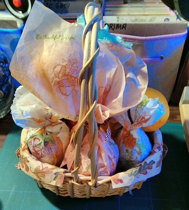
A TISKIT A TASKIT, WHAT SHOULD I PUT IN MY BASKET?
Why fruit, of course!  BUT I needed PAPER to wrap the fruit .  I grabbed a few stamps
Voila!  Wrapping paper!  I made three different wrapping papers!
 And then I decorated my basket with a bunch of stuff from my stash!
HAVE A HAPPY THANKSGIVING!  FROM MY HOUSE TO YOURS!
Hugz,
CHANA MALKAH